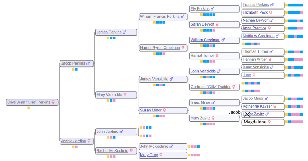
This post represents a little aside in seeking to interpret the family subgroups generated by Genetic Affairs. In particular, I want to understand the nature of the gray dots. So let’s go ahead to the cluster diagrams of the Perkins subgroup so we can better understand the results when we talk about the Perkins family at a later time. We need to tree to start, so below is a six generation family tree for WAB materal grandmother, Olive Perkins.
To analyze the data, I reviewed the 30 cM results uncovered in Pt. 1. Then I created a 20 cM genetic affairs chart using the extend-a-cluster technique described in Pt 2. This technique yielded 164 shared matches on ancestryDNA along with 19 clusters and 9 single matches using Genetic Affairs. Ironically, you can ignore all the pure Y’s (descendants of Jacob and Jennie). Y’s are technically associated with every square, so their presence in a given cluster doesn’t really mean anything, and tends to muddle the Genetic Affairs analysis.
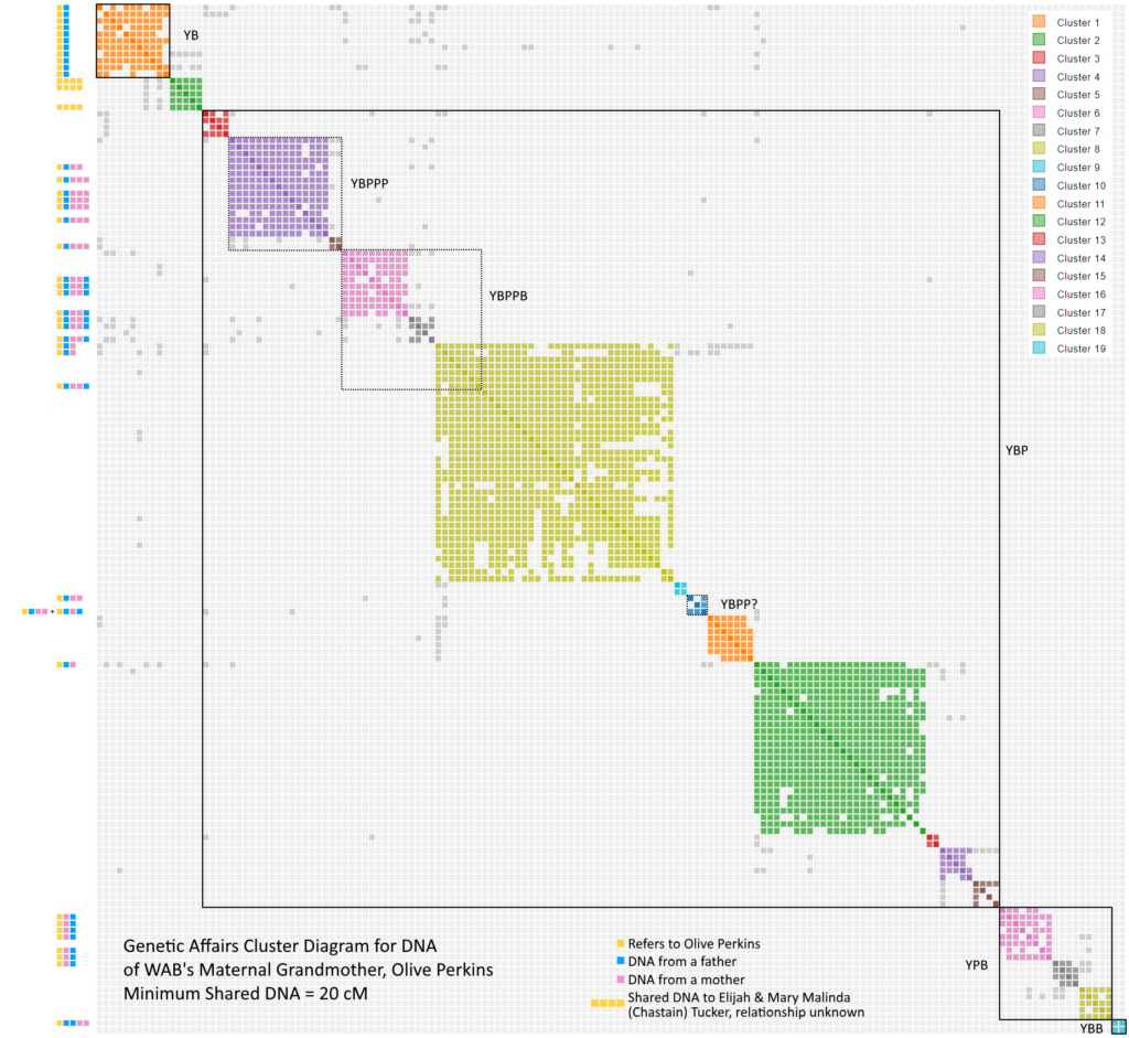
Genetic Affairs did a very good job of organizing the clusters but it did experience some difficulties. For example, note that YBP is found in both clusters 8 and 12. It is worth noting that both of these clusters appear to have extraneous parasitic shared matches. Since I have the added knowledge of the tree, I wondered what would happen if I reordered based on the known matches. Many thanks to my trusty son who wrote a routine to reorganize the clusters in Genetic Affairs. This routine allows me to turns off dead-end matches, and to reassign a match from one cluster to another. You can edit these features yourself if you launch the link below and go to the section entitled, “AutoCluster Cluster Information”. Click on the cluster number of change the assigned cluster of a given shared match. Use the check box to turn on/off a particular shared match. Then hit the “Update Cluster Chart” button.
Click here to generate Genetic Affairs Cluster Chart which you can editUsing the routine, I was able to generate the modified cluster diagram to the right. Note a large number of gray dots. In part 3, I speculated that this gray was due to endogamy or pedigree collapse (take your pick). However, that concept needs to be revisited. It turns out that gray will occur “naturally”.
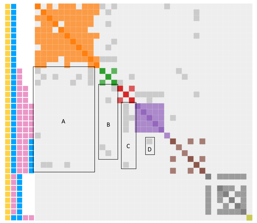
To see this phenomenon, I created a idealized version of a pedigree chart for Genetic Affairs assuming no endogamy, no pedigree collapse, and no minimum threshold. Here are the characteristics:
- The size of the clusters will increase with each generation because the number of descendants increases
- The level of shared match will go down with each generation because the DNA is diluted. This is illustrates using lighter sides of purple in the diagonal.
- Regions with gray dots will exist. Violet (V) will be found in every descendant because they all have V in them. Violet-Blue will be found in every descendant that starts with VB. VBP (P=pink) will be found in very descendant that starts with VBP. And so on.
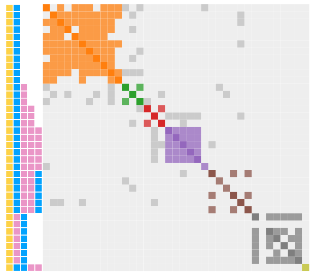
Now time to revisit the gray in terms of regions labelled A through D
- A: YB shows gray sharing with YBP, YBPPP and YBPPB
- B: YBP shows gray sharing with YBPP and YBPPB
- C: YBPP shows gray sharing with YBPPP and YBPPB
- D. YBPPB shows gray sharing with YBPPP
Regions A through C are fully expected since they show DNA being passed “normally” with no need to introduce endogamy or pedigree collapse as shown in the idealized chart above. Only the single gray dot in region D is unexplained since YBPPB should not expect to share a match with YBPPP.
Although the modified cluster diagram actually shows a normal genealogically response with little endogamy, questions remain in the original cluster chart. I still don’t know why YBPxx has such a high amount of shared matches, although, it should be noted that this level is an indicator of endogamy. Finally, I still don’t fully understand those parasitic shared matches concentrated in clusters 8 and 12.
Maybe, I will learn more when I examine the Woods and Baker subgroups.
